ROBUSdirect User Interface
To work with a PHP developer to create a highly intuitive, highly functional, online ordering system for ROBUS. Users are to be able to login, see how much they have spent, search for product, browse products, check stock, check basket, order, view previous order and export PDF invoices and credit notes.
Giving The Customers Access To The Warehouse
In 2011, ROBUSdirect was struggling. The initial version was hard to use, it was even harder to update and the uptake for its use by customers and staff had been poor.
I was part of a two man team tasked with it’s redesign over six months. Taking a ugly duckling and creating a swan that captures 40% of all ROBUS sales.
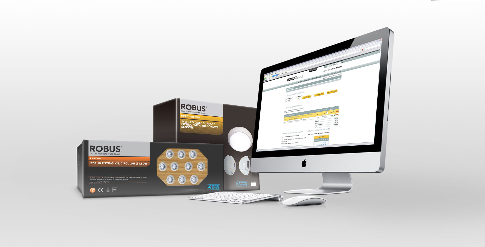
Designed For The User
In the two years that since ROBUSdirect had gone live, the website had not become the success LED Group had hoped for. It was anticipated to have been the industry-leading online ordering tool for the lighting sector.
Initially designed to be consistent in look and feel to the existing LED Group / ROBUS website. Every interaction for both the front-end and back-end user was convoluted and time-consuming.
The Website struggled to keep the user coming back and using it as a tool.
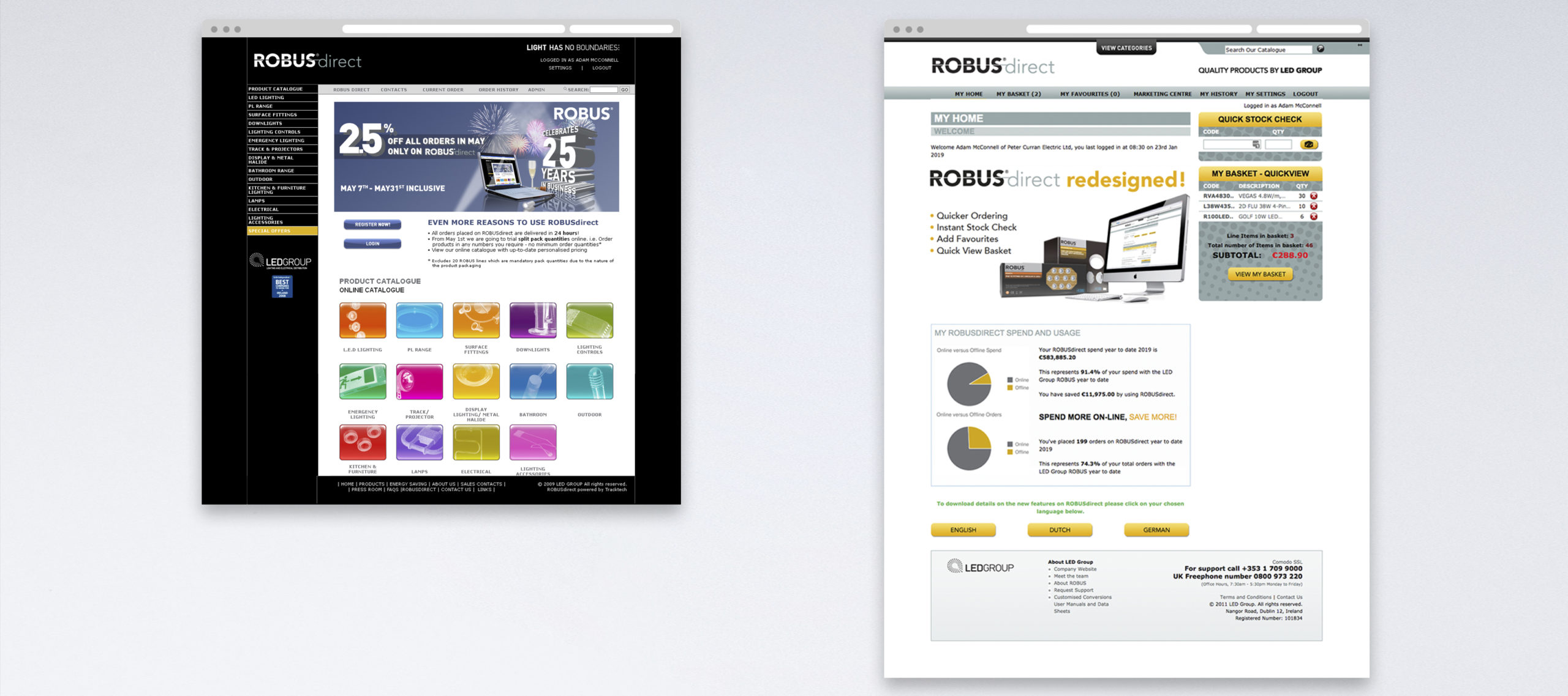
THE TASK
Make It Work, Make It Useful, Quick
Our goal for the project was to completely redesign the website application from the ground up. Every click, interaction and transaction was to be streamlined to ensure a fast, informative and useful sales tool.
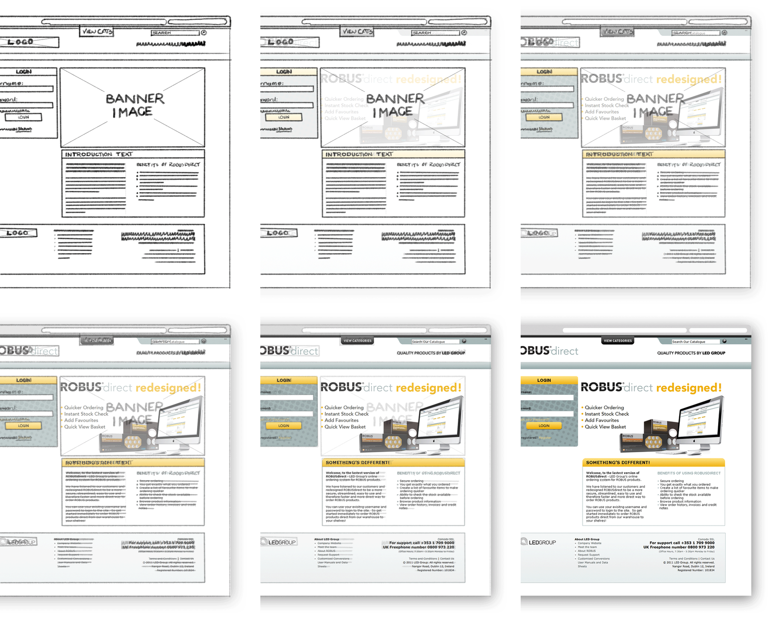

My Role
I worked with a PHP developer to guarantee the look and feel of the website was in keeping with the high quality and superior performance of the ROBUS brand of products.
I also aided the PHP developer in strategizing, researching, prototyping and building the User Interface for all user types.
In addition, I worked with our IT team, to enable the exploration of using web services to allow the website not only read from but write to the Company’s sales system.
KICKOFF
Defining The Real Issues
There were the perceived business issues as already mentioned. But, the most important task of the project was to figure out the real issues. What were the obstacles inhibiting the user’s enjoyment of using the website. We set about figuring out and defining the core user issues.
Who Is Really Going To Be Using The Site
We canvassed our Management Team, Sales Teams and our Customers to determine the real user the site should be aimed at and what their needs are. It was established that apart from LED Group staff that would be updating and maintaining the website, the main users of the website would be the Purchasing Officer in Wholesaler branches.
Give Them Only What They Need
Users of the old site complained that they couldn’t order quickly; find out if the product they wanted to order was in stock, and quickly re-order items they sell a lot of stock of. They also complained that they couldn’t go back and see what they ordered and what credit notes had been issued against backorders.
Data Sanitisation & Validation
In the first version of ROBUSdirect, it took too many clicks to find, select and order products and collected data from forms was not being validated properly leading to orders not being delivered to the correct location at the correct times.It was made requirement that all data collect would be validated before writing it into the system database.
Hide The Navigation
The ROBUS catalogue in 2010 had 14 categories each with two to twenty sub-categories in them. In ROBUSdirect, this meant a huge amount of the screen real-estate was given over to the navigation making the important product information smaller and making the interface confusing.
Dual Entry
The first iteration of ROBUSdirect, didn’t write orders to the system. These orders were captured to an email and Internal Sales staff would then enter the order onto the Sales system.
In addition, I worked with our IT team, to enable the exploration of using web services to allow the website not only read from but write to the Company’s sales system.
CLEARER UNDERSTANDING
Keeping It Simple
Before we put pen to paper, the full business had to agree on what success would be.
In meetings and workshops with all the key stakeholders, we needed to capture what were the key features that were required that would benefit the user.
The key features were, the hidden navigation, stock check before ordering, validated order form and access to critical documentation, writing orders directly to the system.
THE REDESIGN
Line One Rebuild
We started by creating Personas and a User Journey Maps to identify the key functions the Customer would require every day to help them to their job and make ordering ROBUS products online quick and easy.
We performed a Task Analysis for each, and every user interaction based on the User Journey Map and endeavoured to minimise the amount of hits to the database down to ensure fast page loading even though every search form would autofill to help select the User’s required product.
It’s All About The Customer
In conducting the technical research for the website, it was decided to make the experience all about the customer from logging in to taking the order.
The “Customer” experience is based around the Customer’s one set of commercial terms, sets of products available in the ROBUS and Own Branded Products, Pricing Lists and Special Pricing for Products, and Special Payment Terms.
To allow each Customer’s experience to be personal to the user, every page when the Customer is logged in, would have ‘My’ in front of it.
It’s A Navigation But Not As You Have Seen It!
To ensure maximum legibility for product information and imagery, we looked a different way to hide the navigation and make the most of the screen real estate for relevant information. We settled on a tab that logged in Users could click on and a dropdown of the categories would appear.
No matter what screen you are on, it would allow the user to quickly and easily navigate to any product category within two clicks without detracting from the content on the page.
Virtually Checking What’s Available To Order
The Quick Stock Check feature allowed users to enter a code or description and allow the user to select from a product from a list. Then enter the quantity they require and the site would show if they could order that quantity in green, there could be stock issues in yellow and out of stock in red and a date when the product was due back in stock. If the product could be ordered there was an add to basket button which would add the quantity of the product to their basket.
All They Really Want Is To Product Quickly, No Fuss Required
Ordering product is all a Purchasing manager in an electrical wholesaler wants to do. The quicker and easier that process is for them, the better. So we wanted the Users to be able to add products, delete products, see what is in their basket and check stock from their homepage, product category listing page, product detail page, and their favourites page.
Users could amend their order from these pages with buttons allowing them to increase, decrease or delete the product from their basket with ease. I chose that we would use traffic light colours to help reinforce the positive aspects of ordering more products.
My Basket Was The Toughest Nut To Crack
The Ordering process was the toughest to do. With so many considerations based on the customer, what customer group they were in and the pricing they had available to them, their location determining when they would get their product and allowing the User to change the delivery address should the order need to go straight to a specific address.
Here we elected to allow the User to:
- Add Products by searching by Product Code
- Where required, allow users to import a CSV file with their Purchase Order to populate their order, eliminating dual entry on the Customer’s side also
- Confirm the delivery address and specify where they want their delivery to go
- Schedule their delivery date
- Reference their Purchase Order for ease of Invoicing
As all this information is written directly to the Company’s Sales System, the captured data needs to be sanitised and validated to ensure the order doesn’t break the database. We decided the order button would remain inactive until all inputted information complied with the validation.
LAUNCH
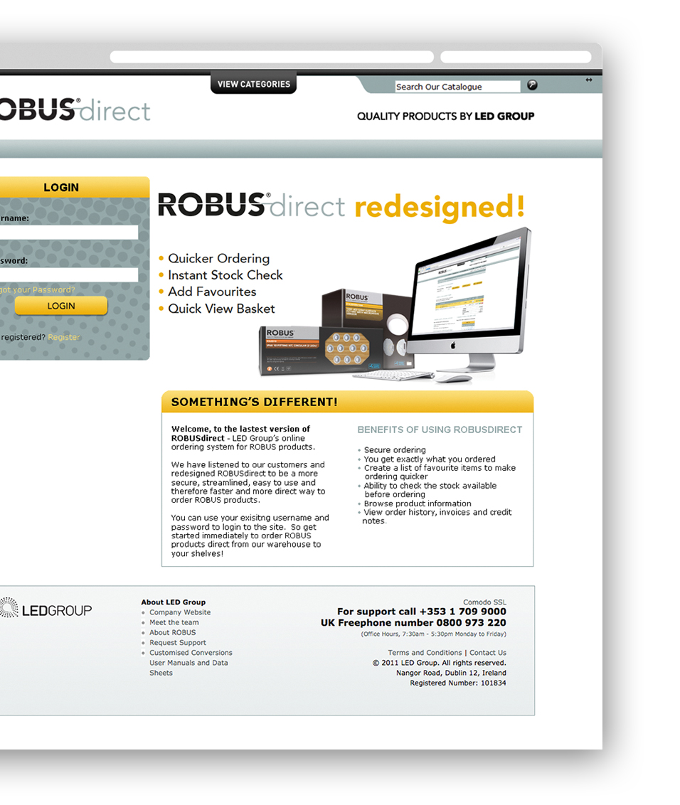
ROBUSdirect Redesigned!
The new version of ROBUSdirect went live in July 2011 and immediately the website became a massive sales tool for the business.
THE IMPACT
A NEW Website – A New Tool
The redesign had an instant impact on the business. Engagement with ROBUSdirect increased as Customers immediately gravitated to a tool that made their jobs easier.
Percentage of Total sales taken went from 15% in 2010 to 40% by the end of 2012
Average Sales Order Value grew to by 21% in the first six months after launch
